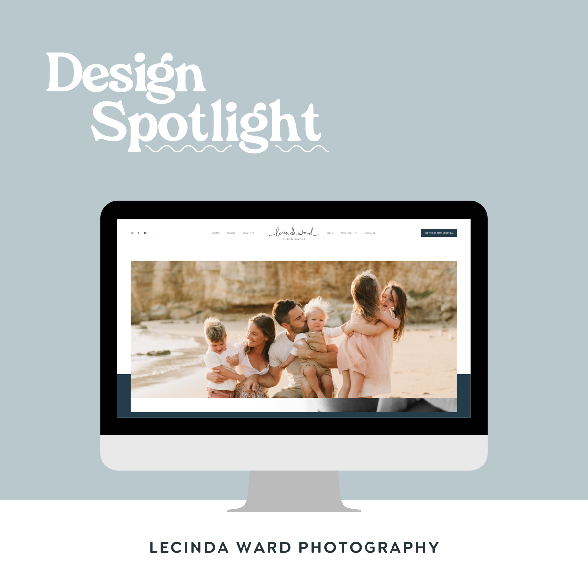
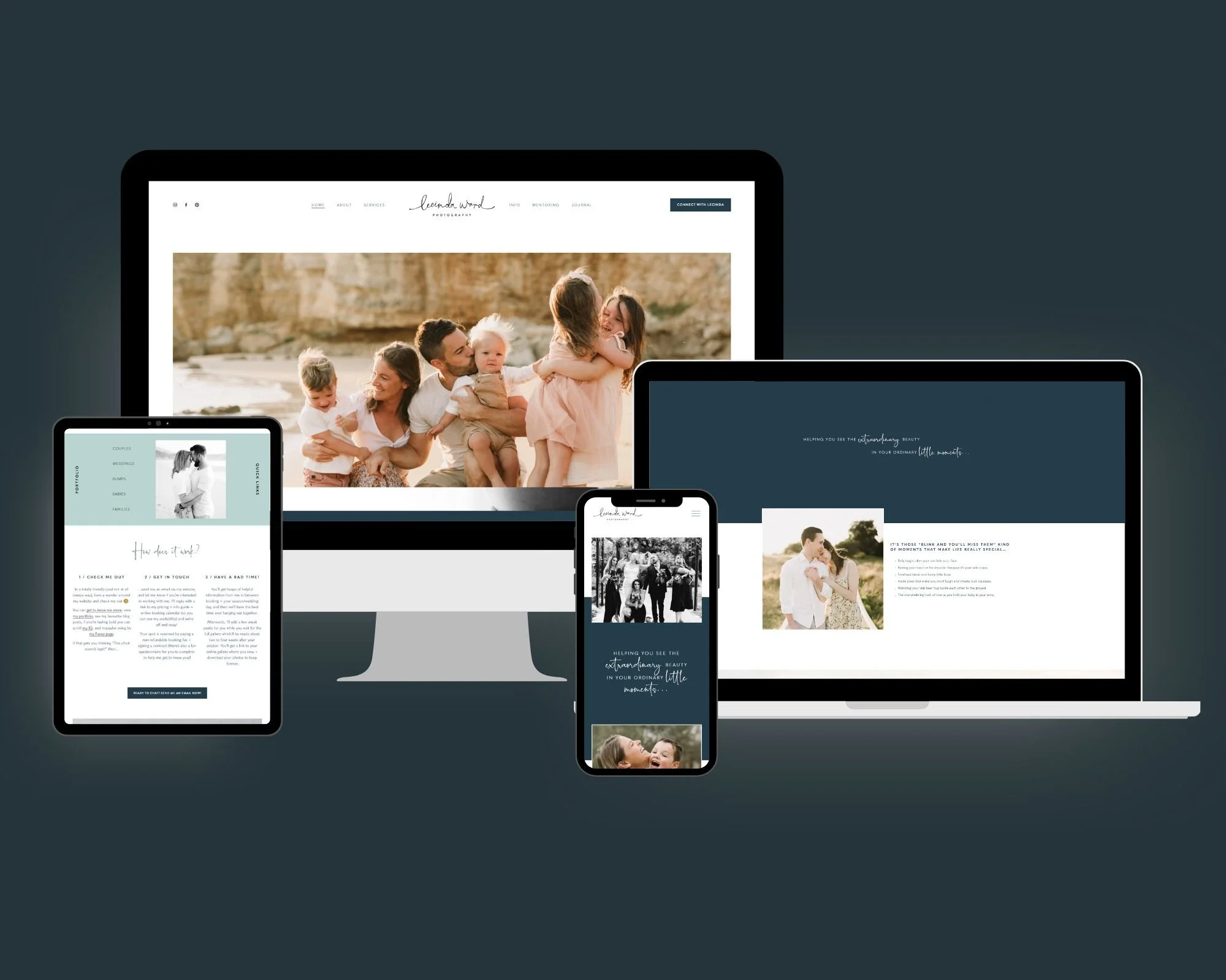
Client | Lecinda Ward Photography
It feels really weird to talk about myself, but when I was re-designing the website for my photography business I tried to separate myself from the project, and treat my photography business as if it were a client I had never met before (which is actually really hard to do).
My photography business is 9 years old now, and the amount of content I’ve collected over those years is astronomical! The whole re-design took me about 6 months, because not only was I redesigning the website but applying all the new copywriting tricks + tips I’ve collected over the last few years and re-writing the whole thing.
I’m so, so proud of how this website came together. And to be honest, the amount of compliments I’ve received about it and the subsequent “can you help me with my website???” is what inspired me to create this business.
So - in honour of actually treating this business like a client, I’m going to feature it like a client here as well because we all deserve to talk about the things we’re proud of.
Let’s dive in.
Design Brief
ABOUT Lecinda
Okay it was way too weird writing about myself in third person, so I’m just going to talk to you like normal now, k?
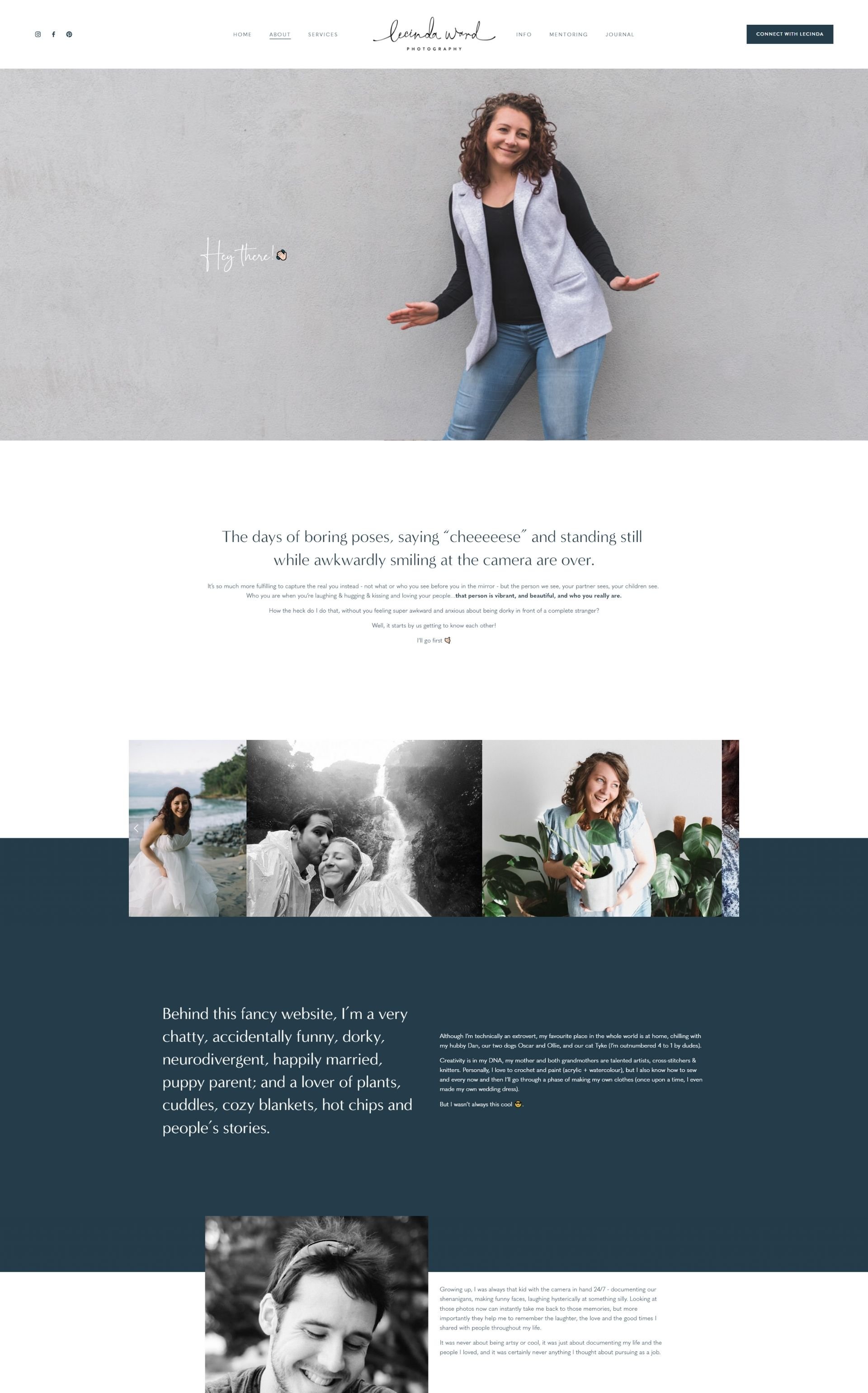
When people who don’t know me ask about me what kind of photographer I am, these days my answer is this - I’m a photographer of people and their love stories, which covers everything from couples to weddings to newborns to families, in whatever order people choose to experience those milestones.
BRAND STYLE GUIDE
The version of my website before this re-design was actually “fine” and serving it’s purpose well. My design ethos was very “image driven” - I wanted my photos to speak for themselves. This served me well, but I was essentially hiding behind my photos - literally and metaphorically.
The whole COVID lockdown saga we had in Melbourne really forced me to confront myself, and go through a lot of emotional healing. One day, as I was scrolling through my website, I realised it no longer reflected who I was.
Enter - my re-brand. As I mentioned before, I tried to step outside of myself a bit (and remove myself from my ego) and treat this business like something new. During this process, it became important to me that:
I crafted more intentional written copy, that would speak more directly to my target audience and the kinds of people I really loved to work with.
I could introduce my new brand colours to the website, to help my photos + content pop. This also allowed me to introduce some variety into my background, instead of using photos or white space at every opportunity to create some space between all the text.
Portfolio at a Glance
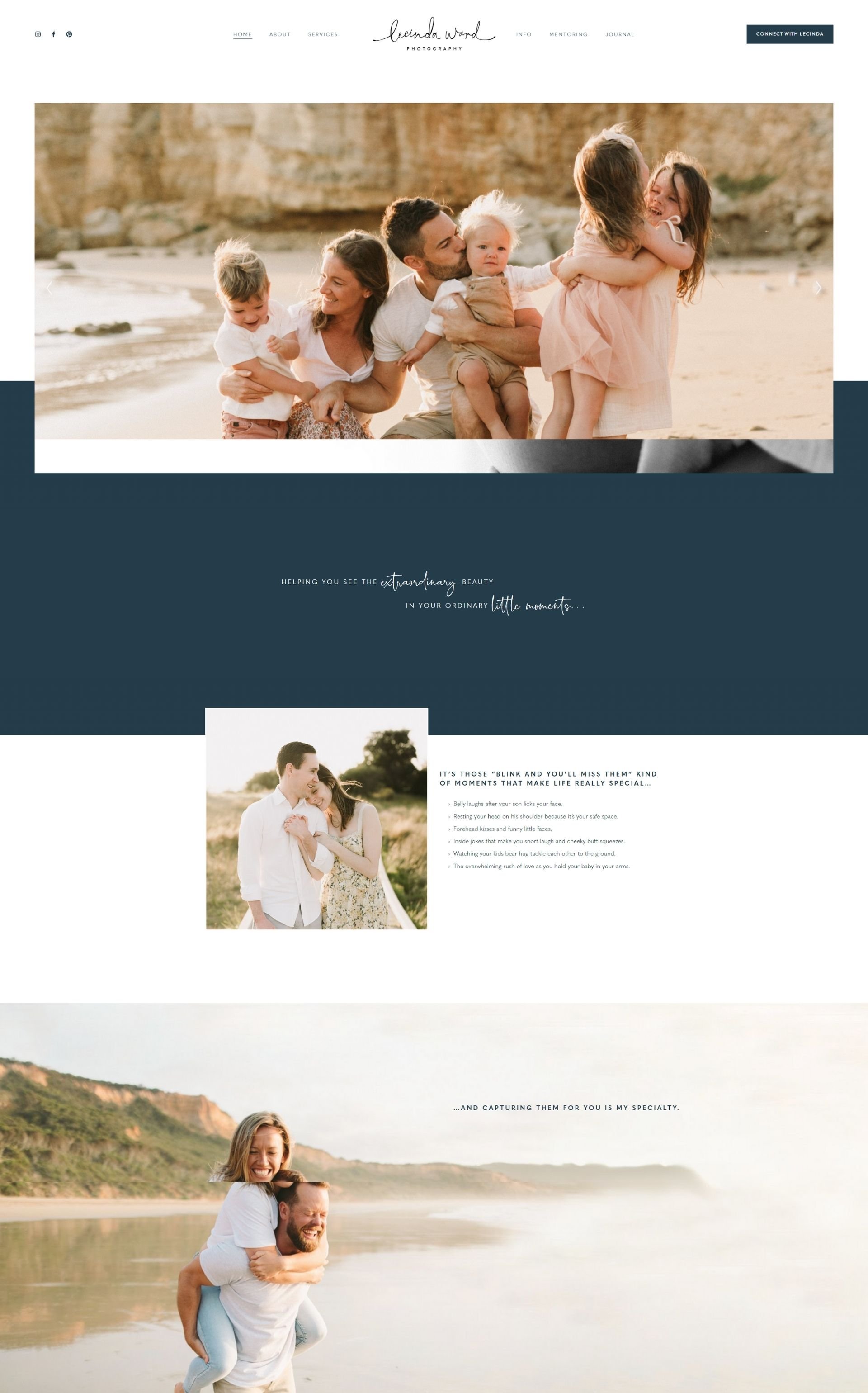
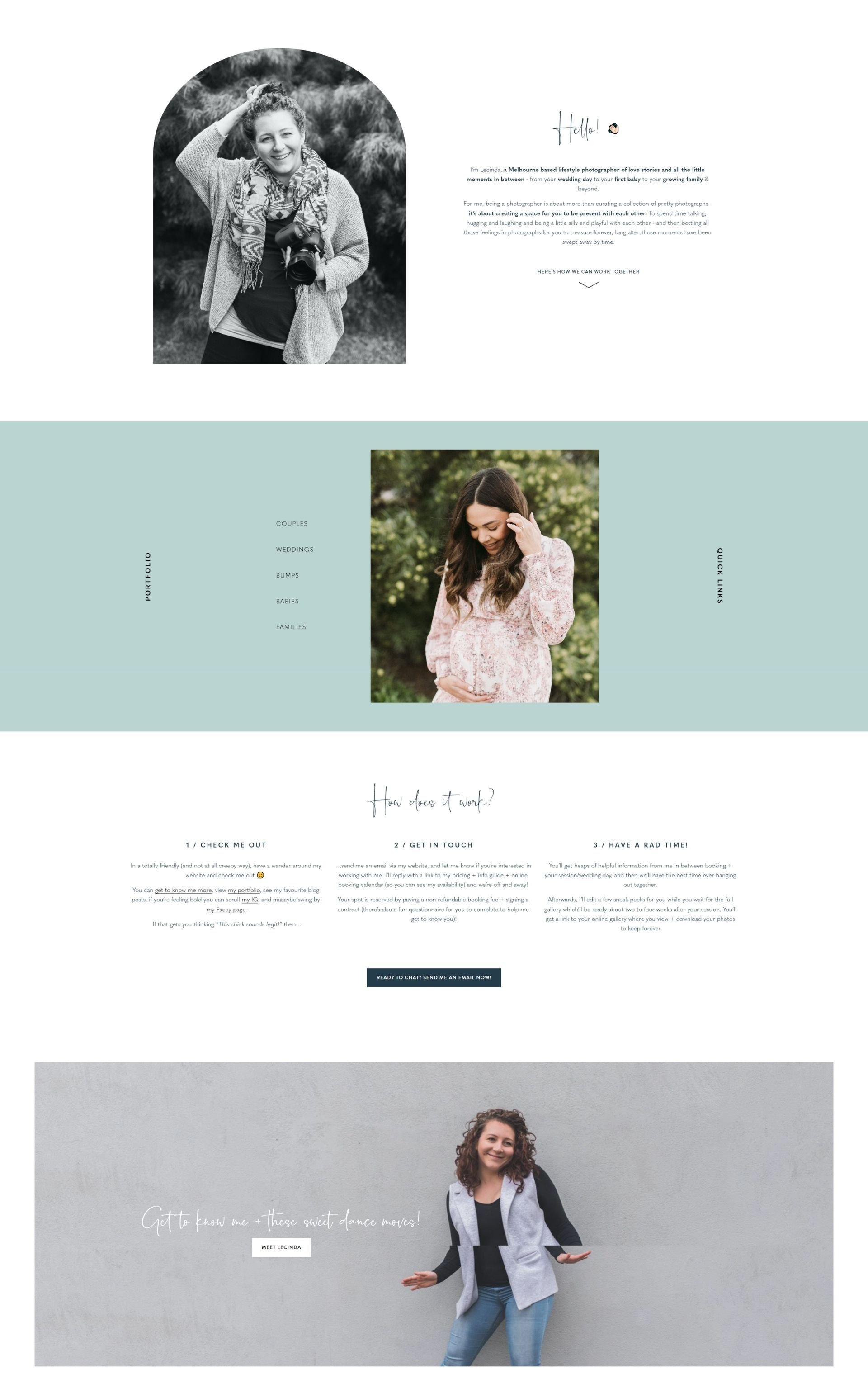
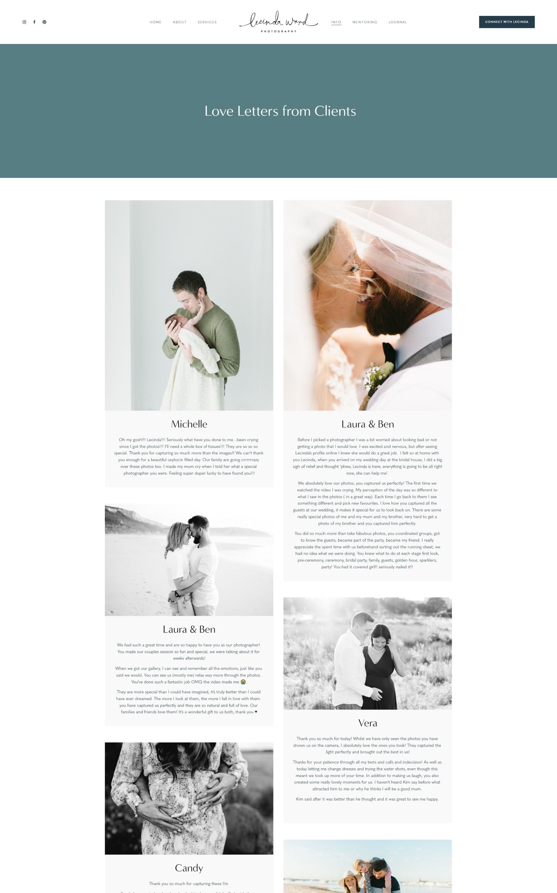
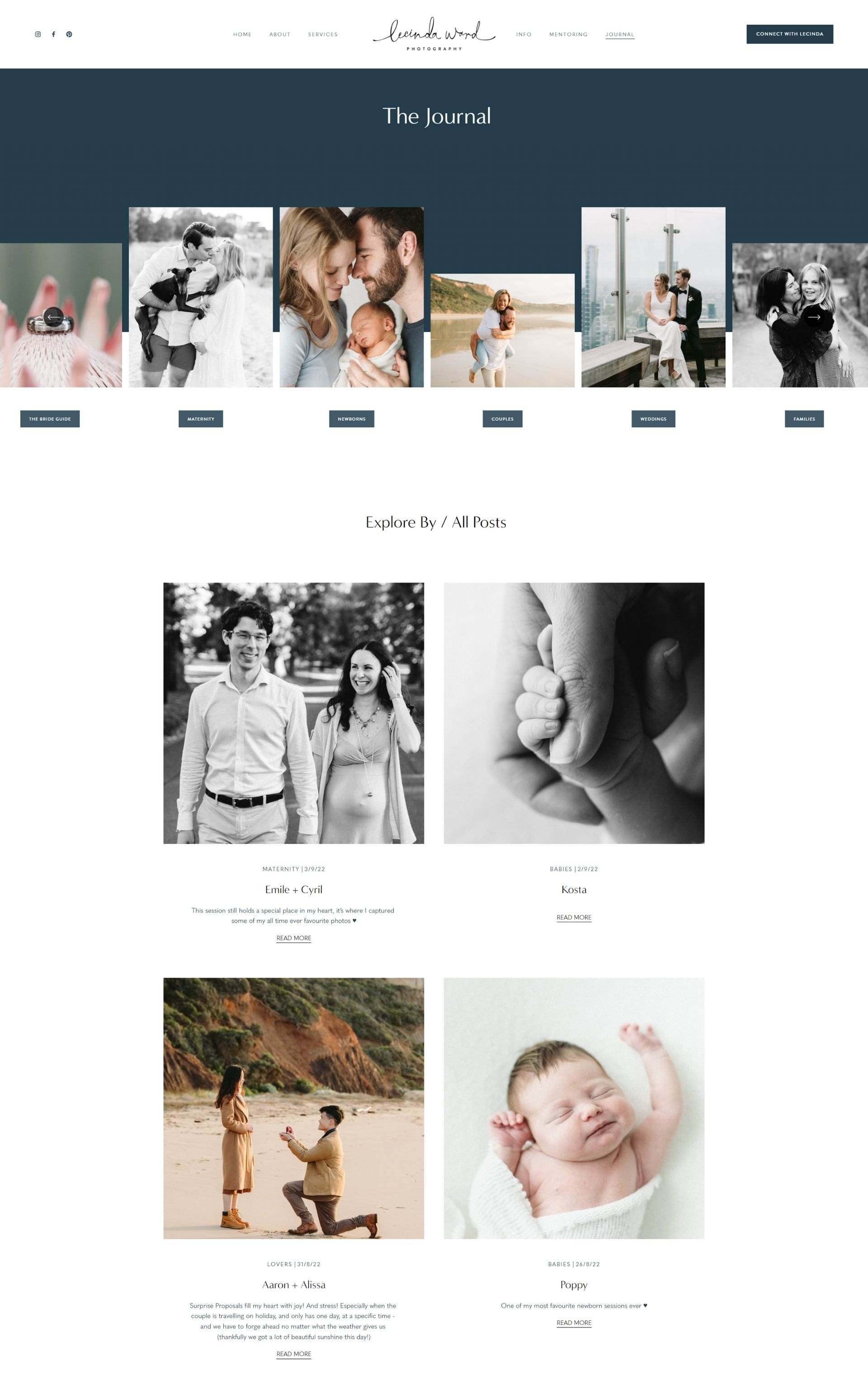
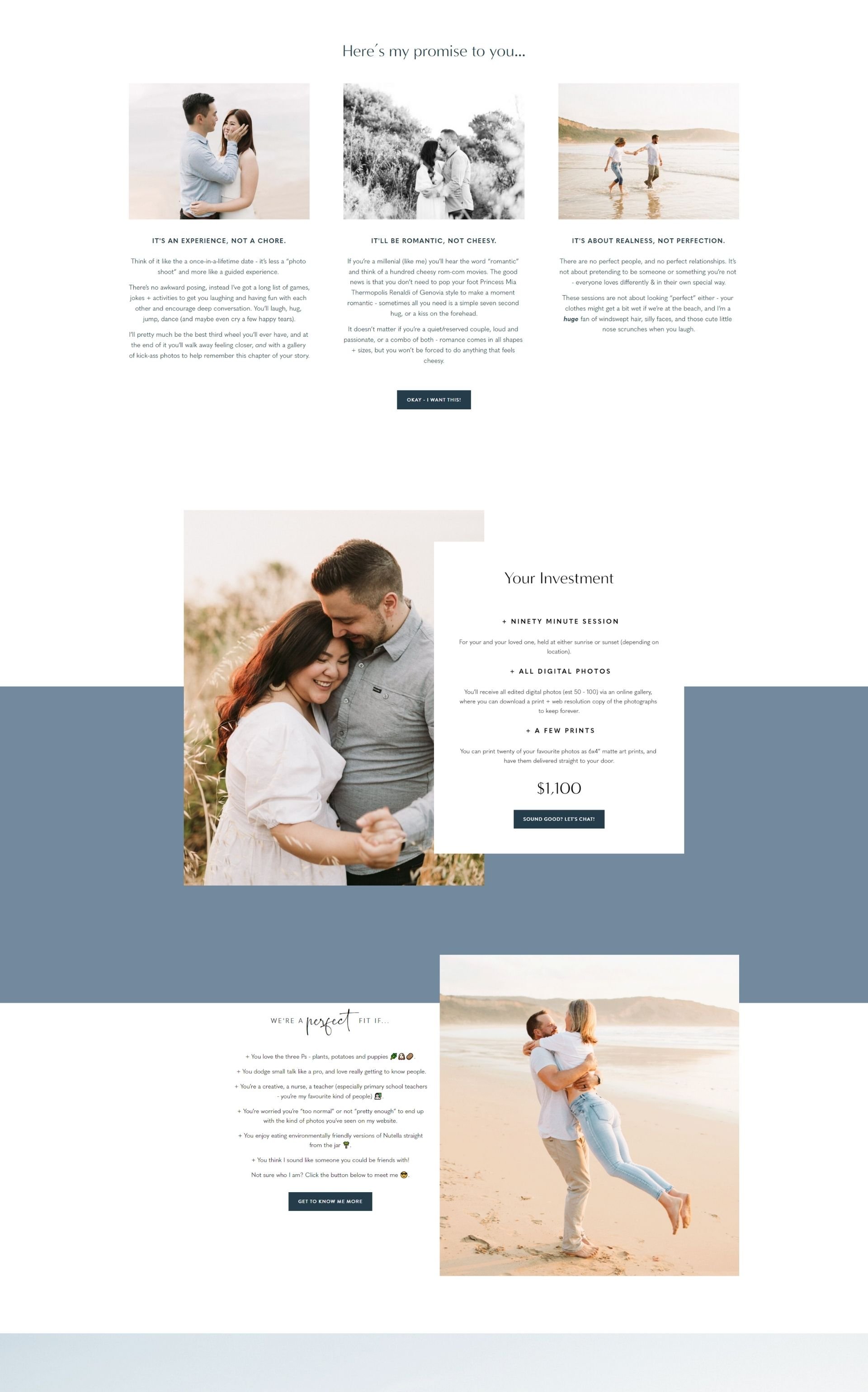
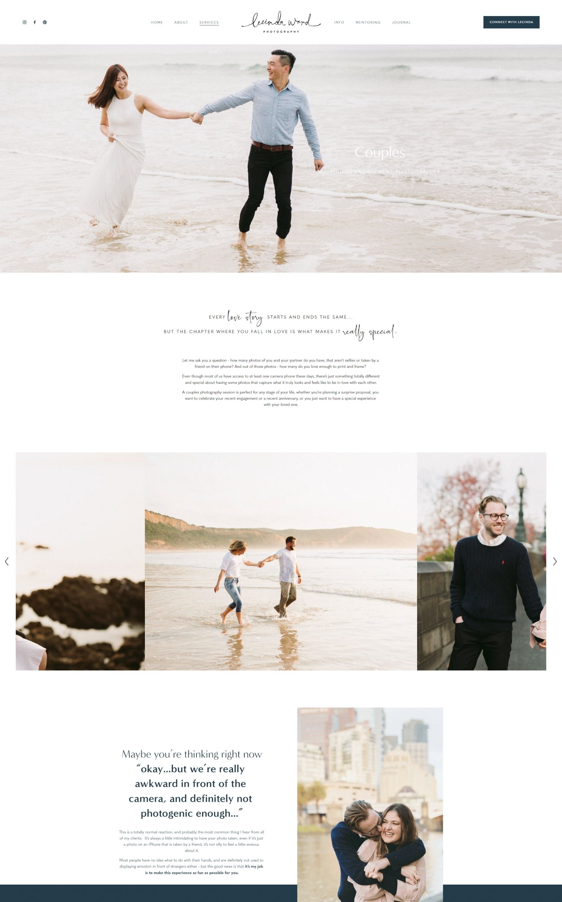
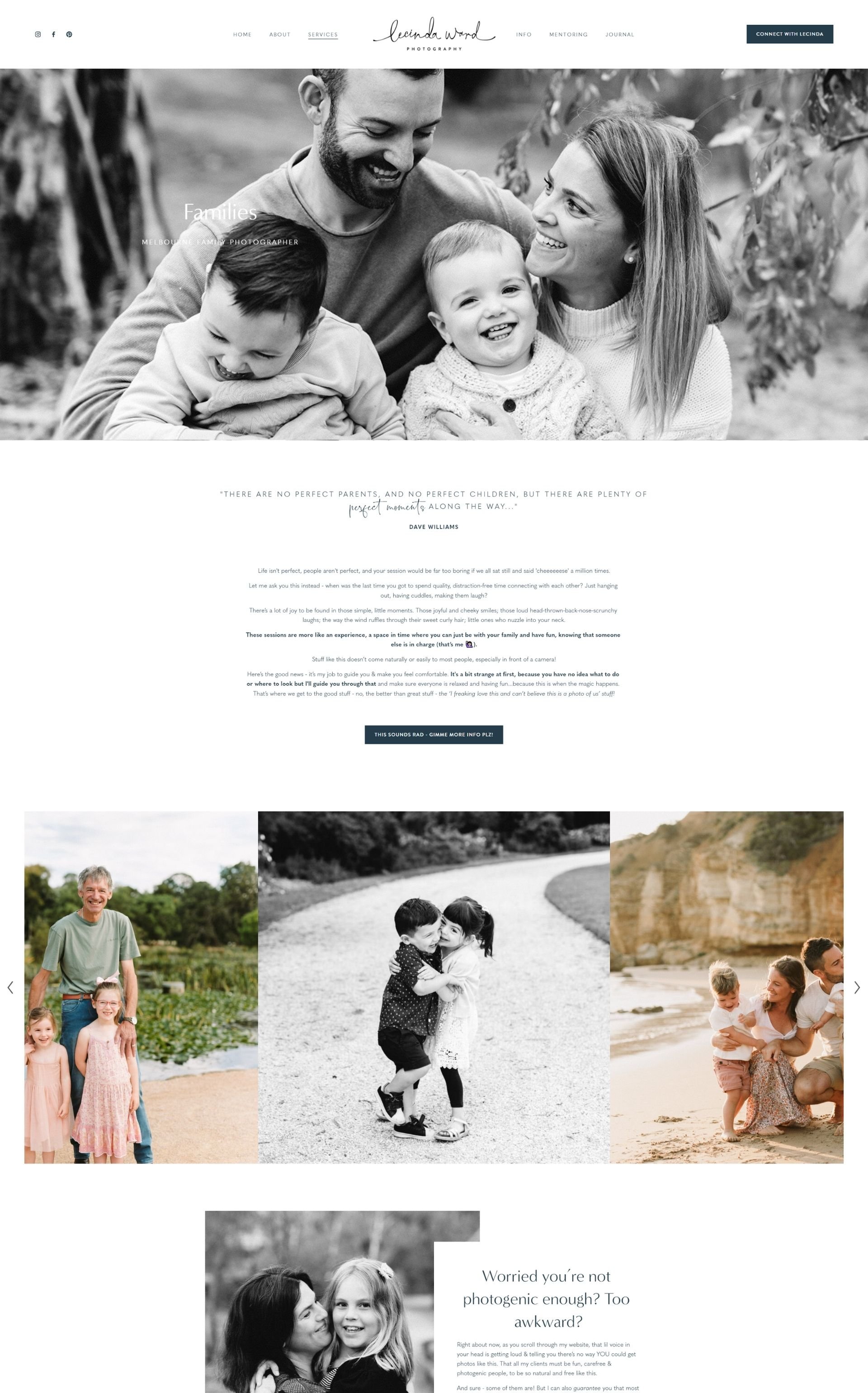
Here’s a few screengrabs of my favourite pages on her website - the full site can be viewed at www.lecindaward.com.au.
Interested in working with me on your website?
If this has inspired you to take another look at your own website, if you need any help I would love to hear from you! Even if a fully custom package is not within your budget, I do offer design days & shorter tech support packages that might be exactly what you need to get going on your own.

